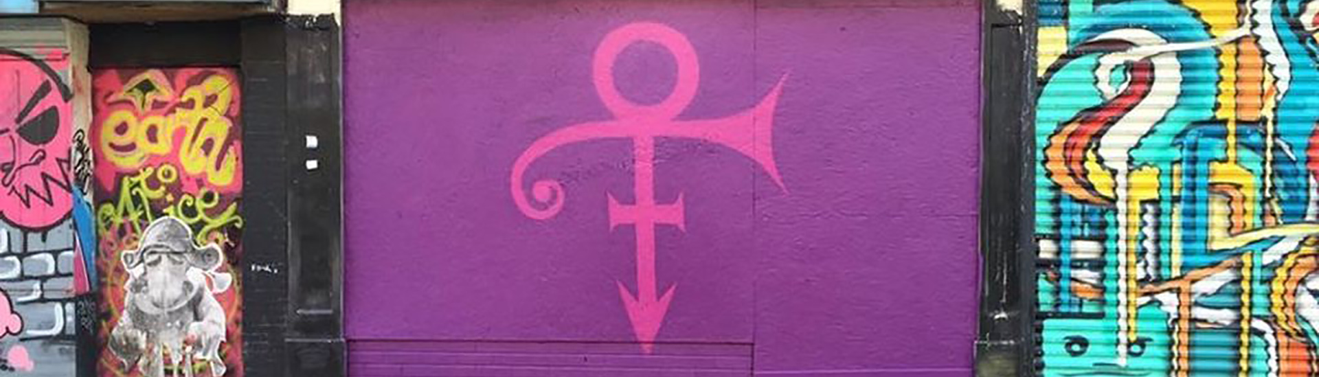
Looks promising. Pic by @DownInAutumn

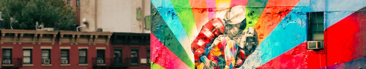
Looks promising. Pic by @DownInAutumn
Animation by Namchild (based on ‘Duel’ by Lohenhart)
All effects (incl. motion blur/explosions/wind/wood etc.) are in shot and were happening as the picture is taken. No cgi is used. Photoshop is only used to remove support wires etc.
Lohenhart.
http://www.youtube.com/user/Lohenhart
Official music –
Camo & Krooked
http://camoandkrooked.com/
Hospital Records
http://www.hospitalrecords.com
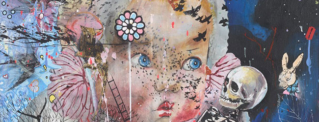
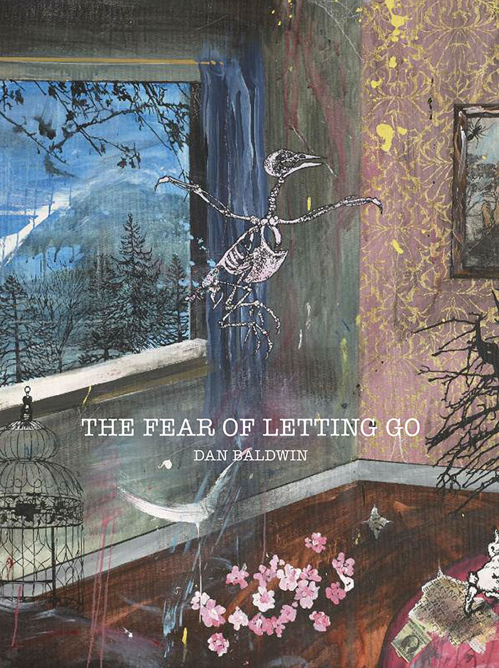 In conjunction of Dan Baldwin’s new show, ‘The Fear of Letting go‘, we are offering a copy of the book that the artist is simultaneously releasing.
Entitled ‘The Fear of Letting go’, you will find all the artworks from the show and more. Last but not least, Dan will sign the book!
To win this book, you just need to subscribe to our newsletter by filling out the form below.
Fear not, if you are already subscribed, just share this article on your favourite social media platform (use the buttons at the top of this article)
‘The Fear of Letting Go’ charts a new direction in Dan Baldwin’s creative practice. His approach to making this new work is more structured and, for the first time ever, Baldwin is planning and constructing his paintings, methodically creating links and dialogues between the different media on show.
Following his sell out New York show ‘The End of Innocence’, this latest collection on display will feature new paintings, bronzes, ceramic vases and original works on paper and wood. ‘The Fear of Letting Go’ will be Baldwin’s most autobiographical and intimate body of work to date.
The work on display successfully retains Baldwin’s signature dense and multifaceted aesthetic, as well as continuing and progressing his engagement with bronze sculpture. His obsession with incorporating found objects and sentimental ephemera is still abundantly apparent as he invites the viewer to delve deep into his past, reassessing feelings of nostalgia.
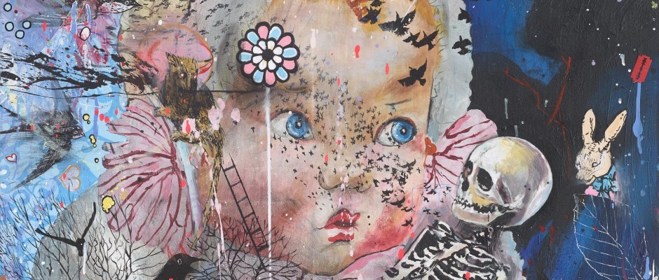
“This new work is a lot to do with memory, childhood and innocence –
most of the new paintings are contained within a room, or an environment. I’ve always said it’s about life and death, but in this body of work it’s more personal…” Dan Baldwin
Read the interview of Dan Badlwin by Lawrence Alkin gallery –
WHAT- ‘The Fear Of Letting Go’ by Dan Baldwin
WHERE – Lawrence Alkin Gallery, 42 New Compton Street, London, WC2H 8DA
WHEN – 1st October- 14th November, Monday to Saturday 11am –7pm, or by appointment
www.lawrencealkingallery.com
We will pick up the 50th entrant to this competition as the winner!
Streetwise characters such as Peck’em Pigeon, Barkin’ Dog, Foxall Fox, Bushey Squirrel and Purr-ley Cat take centre stage in Stephenson’s solo exhibition, something they’re quite used to after being placed in permanent collections such as the Marriott Hotel in Westminster, where their furry faces adorn each and every room.
Following a visit from the whole gang at Jealous Print Studio, the characters have been re-imagined and reinvigorised into brand new screenprint editions, as well as original paintings and a host of other new, very small editions.
Simon Stephenson will also be giving away a very secret, special original to the first 10 purchasers of the new works.
So don’t miss it. Or we’ll send Peck’em Pigeon round.
Simon Stephenson is a London based artist and professional illustrator. He has worked as a creative in advertising for over 20 years. Simon’s work has been featured in the ‘Association of Illustrators Annual’ and used in many advertising campaigns including Telewest, Barclays Bank, Orange, NHS, Jigsaw among many others. His work has been used and featured in several books such as ‘The big book of illustration ideas.’Inspiration is sought for his artworks in London and its denizens, both
human and animal and his work finds a home in celebrity and permanent collections, such as TBC Suggs from Madness and Chancery Court, London.

Location: Moda Hotel in Vancouver
Artist: collaboration between Scott Sueme, Joker, Remi/Rough and Augustine Kofie Context: For the Unintended Calculation show coming up

When I was told about that exhibition – the ‘neon man”, I did not know whether my mate was making a joke or whether there was really something going on but still I had no idea what it could have been all about until I went on to the Spine TV website and find out about Chris Bracey and Bill Elwood: the neon men. Continue reading Chris Bracey: the neon man
Last Thursday night, Nick Thomm’s latests solo exhibition, Tropic Glows, opened.
Thomm took over the entire two-story space, transforming the basement into a fully immersive screening room, in which he housed his intricate 3D video works, while upstairs played host to both the crowds and a combination of Thomm’s mixed media works on fluro Plexiglass, holographic skate decks and neon pieces.
We included below 3 animated GIF works by the artist. We like them very much. Do you?
Exhibition runs until November 18th @ Castle Fitzjohns Gallery. 98 Orchard St, Lower East Side, New York (Open 7 Days, 12PM-7PM).
A Group Show – Never A Dull Moment Curated by iO Wright at White Walls, San Francisco is now underway and I wish I could jump on the plane right now and go and enjoy it with my own eyes.
The collective of artists have all got a graffiti art background and have been asked to continously create and express themselves and they have been using all sort of mediums: short film, sculpture, installation, … everything and anything is on display here. Continue reading Augustine Kofie at White Walls
Since the day we first saw Jonathan’s work in 2008 we have been amazed at how much it has blossomed and how many people have responded positively to his distinct and developing style. Since then several shows at Signal and exhibitions in Los Angeles, San Francisco and Denver have confirmed his international appeal.
Jonathan has achieved that rare thing of combining socio-political subject matter, with a real sense of beauty and truth. Despite the evils in the world he depicts, you come away from a Darby piece feeling refreshed.
Jonathan’s second solo show ‘Favela’ at Signal will take him deeper into the areas of concern he has touched on so successfully before. Concentrating on the favelas (slums) in the big cities of Brazil, Jonathan became acutely aware of the overwhelming social problems facing these communities. The favelas have been abandoned by national and local government and have been taken over by drug dealers and their gangs. A culture of lawlessness and violence exists unchecked, creating a level of poverty that gives Brazil the dubious accolade of nurturing the biggest gap between rich and poor in the world.

Some of the most vulnerable victims of this sorry state of affairs are the countless number of street children orphaned or abandoned by their parents. Jonathan’s show focuses on them and their plight. The show will be supported by the charity CARF (Children At Risk Foundation) that was founded by Englishman Gregory J Smith. Giving up a lucrative business career Smith set up and ran a home for street children called The Hummingford Project in Sao Paolo. Also a passionate photographer he has brilliantly documented this entire experience. Many of Jonathan’s works for the show will use these photographs as source material, creating a direct link to the abandoned children of the favelas. Some of the proceeds of the show will donated to CARF.
Jonathan’s work for the show is moving away from the more obvious use of logos. Instead, he will be using a range of more subtle artistic means to achieve his artistic goals. He has also spent time collecting together wooden objects to paint on, so that many of the works will have a more organic feel to them than his works on canvas. His aim in the show will be to create a unique experience combining paintings with atmospheric installations. This will be Jonathan’s most ambitious body of work to date, exploring an important issue using a wide range of materials and techniques. The show should establish him as one of the most important young artists on the scene.
When: 11th – March – 2nd April 2011
Tuesday – Saturday 12 – 6pm
Where: Signal Gallery | 32 Paul Street, London EC2A 4LB | 0207 613 1550 | mobile 07766 057 212
Words by Signal gallery